Flex (Individual Project)
Flex: UX Design Project
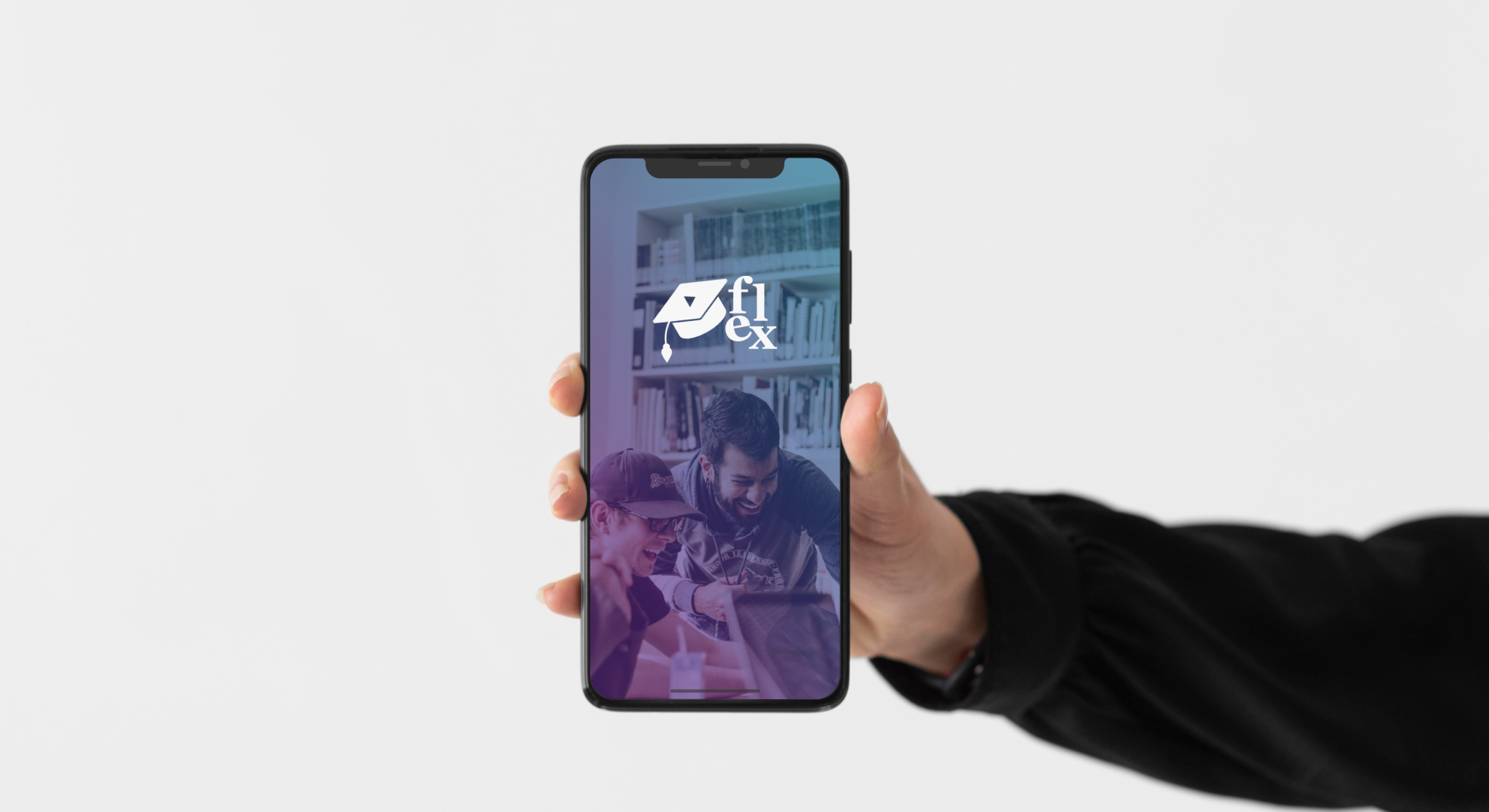
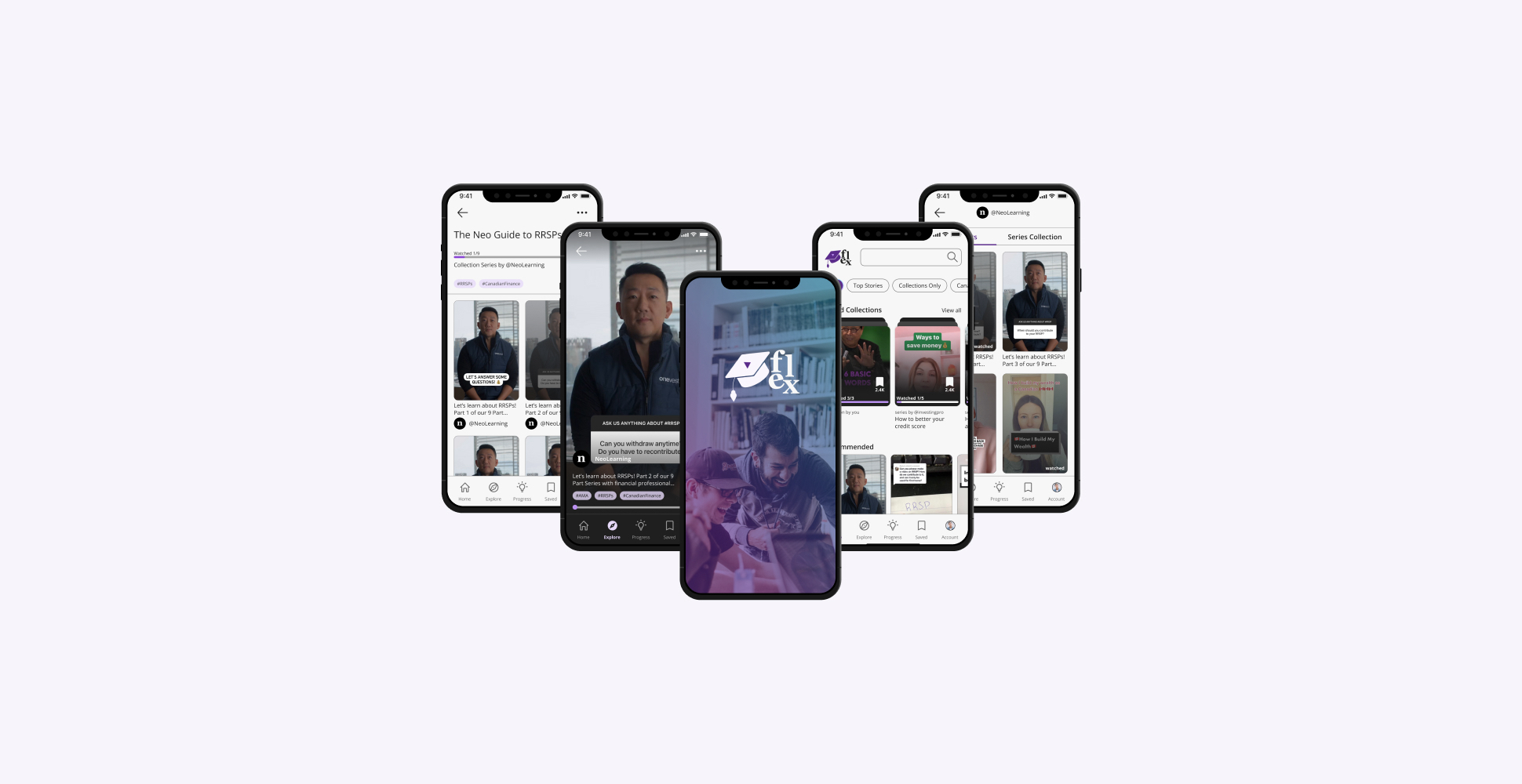
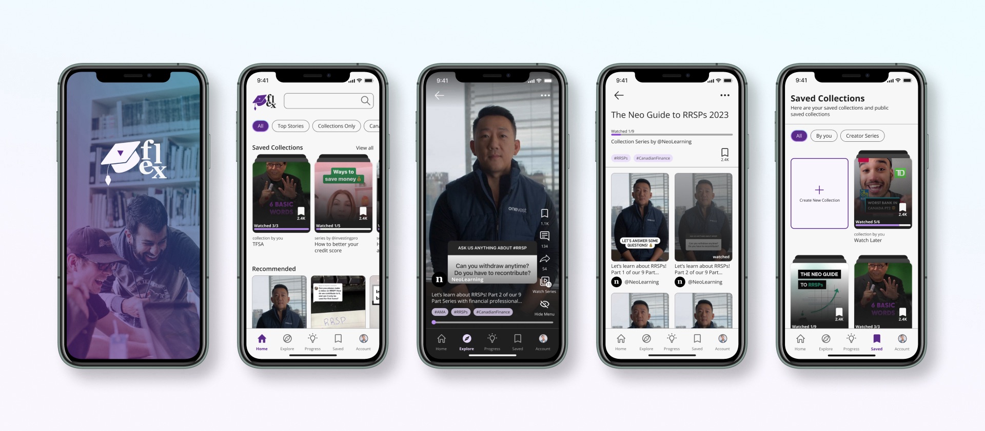
Visit PrototypeFlex is a finance learning app that provides short-form video lessons on various finance topics. The app features videos reviewed by certified professionals and verified businesses. Users can watch these videos at their own pace and save them for later viewing. The aim of Flex is to make finance education easily accessible for the younger generation and to eliminate the taboo of speaking about finances.
Project
Brainstation UX Design Diploma
Timeline
10 weeks // Jan - Apr 2023
Tool(s)
Figma
My Role
Sole UX/UI Designer
Problem Space
The younger generation often lacks adequate education and guidance on personal finance, which can lead to poor financial decision-making and a lack of financial awareness. Financial education is often not emphasized in traditional education systems, and many young people are left to learn about personal finance on their own. This can result in taking on too much debt, failing to save for emergencies, or investing in risky assets without fully understanding the risks involved. Addressing this issue requires more accessible and engaging financial education resources and encouraging young people to take an active role in managing their finances.
Step 1: Discover
Secondary Research
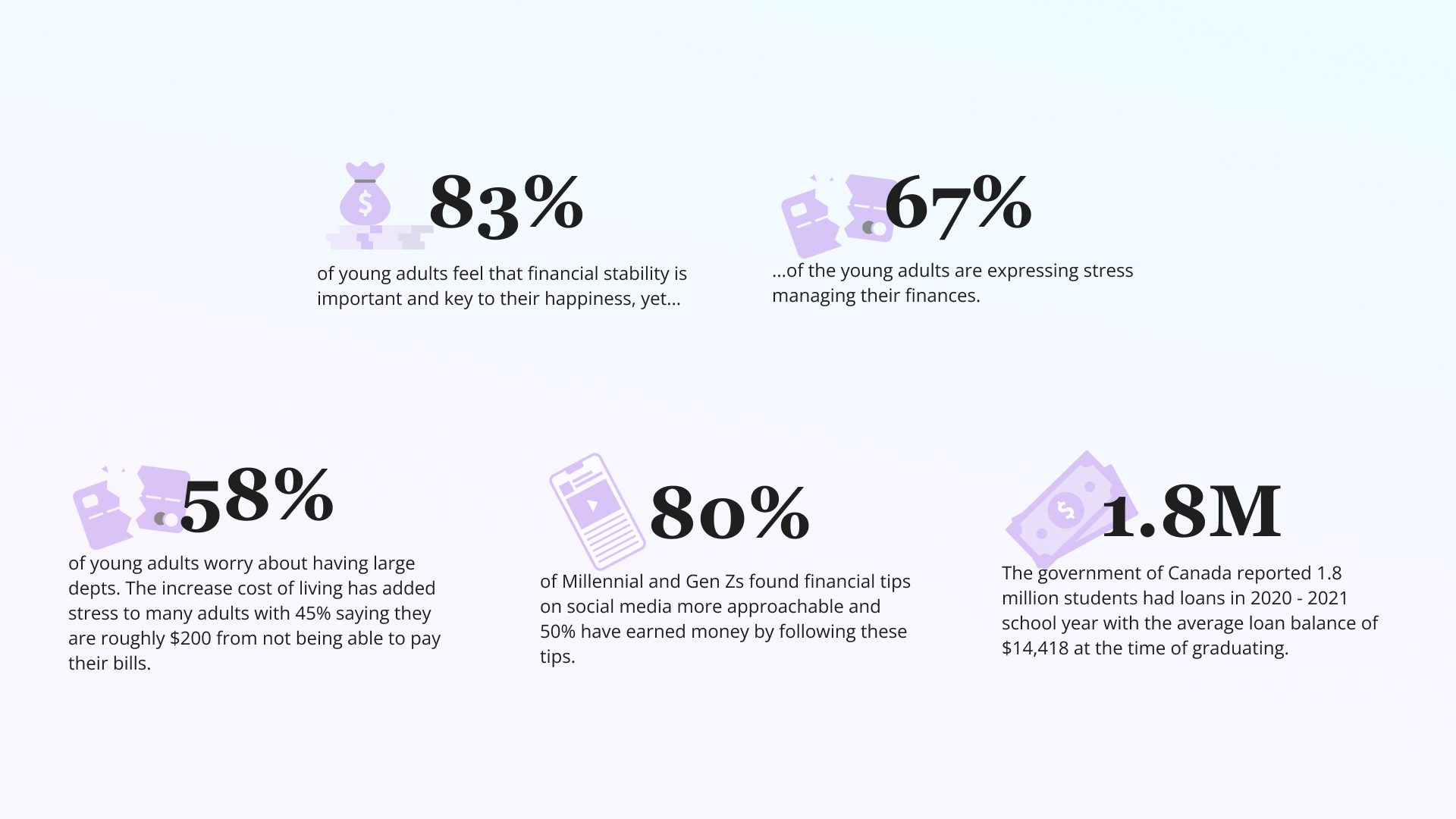
I've always struggled to learn about managing my fiannces and looking to invest for the future but I needed to ensure that other peers are also going through similar setbacks. Here are some key secondary research to back up my assumptions and problem space.
Primary Research
In addition to secondary research, I also conducted my own primary research interviewing 3 adults in their early 20s and conducted a Google Form questionnaire with several other young adults to gauge a better understanding of their motivations and pain points.

Findings & What I learned
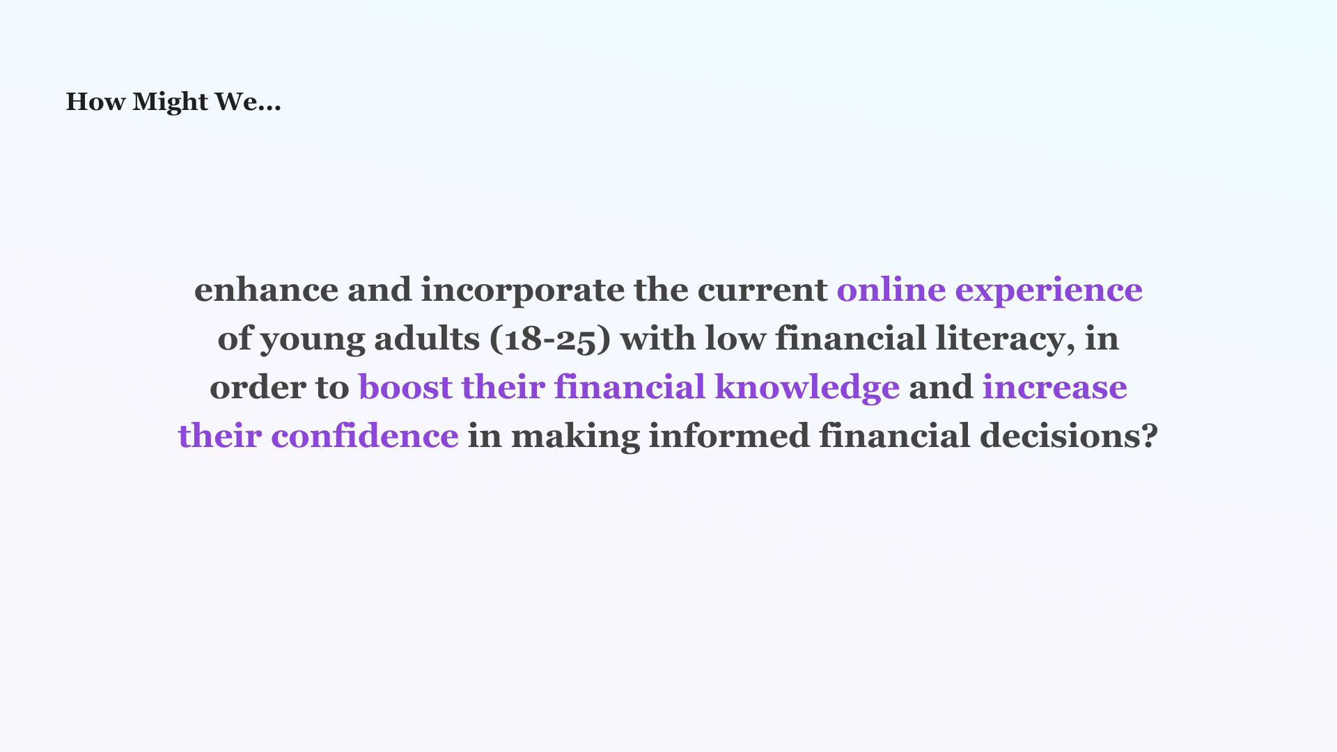
I discovered users are unlikely to ask for help in their financial goals, they are disconnected with the traditional banking methods and prefer to do their own research online. From this, I made the following How Might We Statement...
Step 2: Define
Pinpoint What I want my app to do:
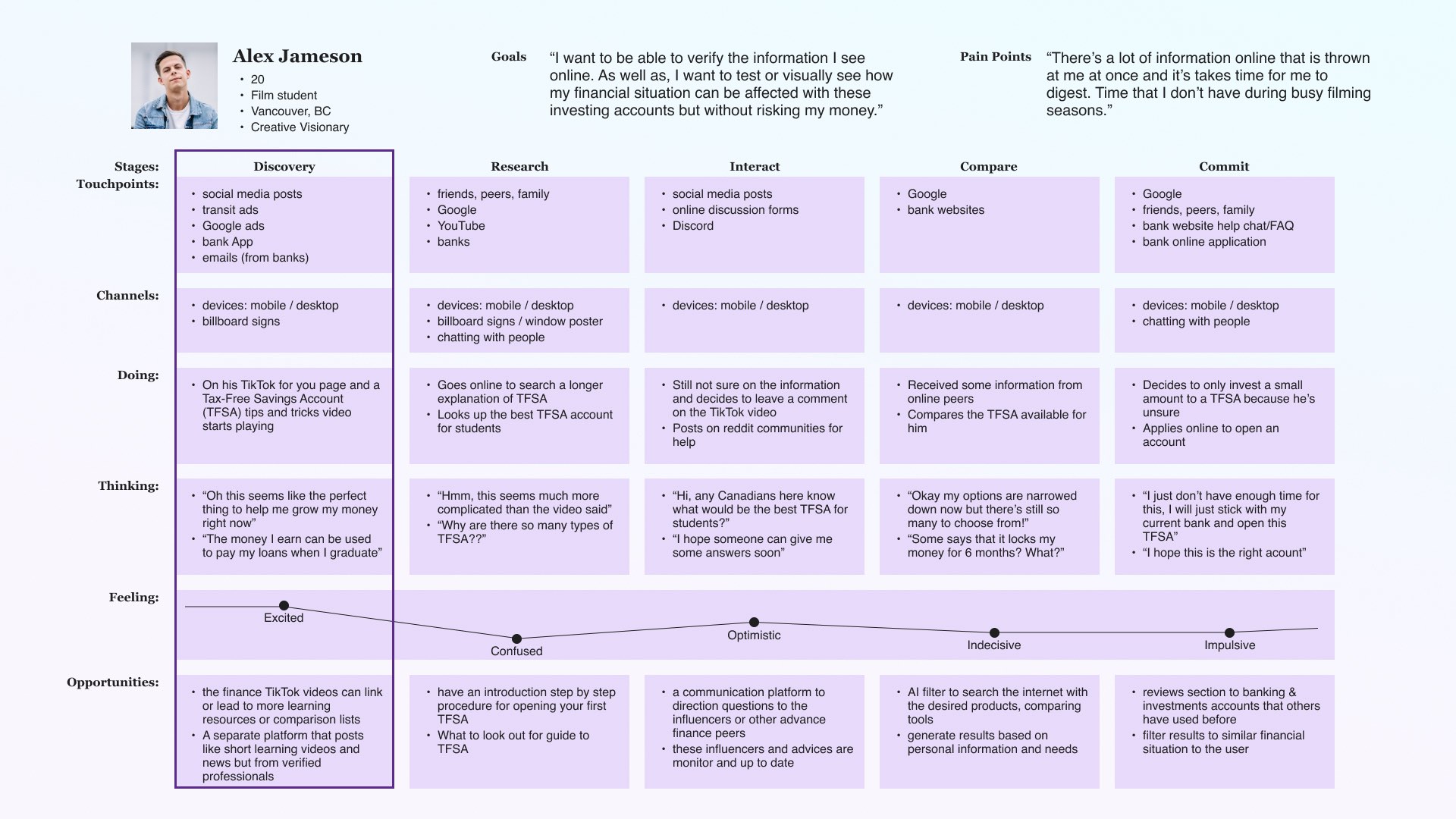
To get a better assumptions how my interviewees and other likely demographics would go through managing their financials (or aka entering the adult world), I stuctured an Experience Map for reference.
I want to highlight the early stages of young adults entering their own financial independence. This period may be hopeful and optomist as younger individuals are ready to be own their own. Before they get overwelmed with the vast world of finances, I want to be able to kick start some short and easy learning points that can start with.
Why I chose this? Looking into what TikTok, YouTube Shorts & Instagram Reels has grown in the last 3 years. We can see that these short-form videos make great ways to deliver information. Ultimately, the goal is to have educational videos, like the new cooking recipe or that new cleaning hack that you watch on any of these social platforms. The hope is that short-form videos can help younger individuals to digest learning content easily. How can we make it short-form videos into a learning platform for users to watch during between their busy schedules.
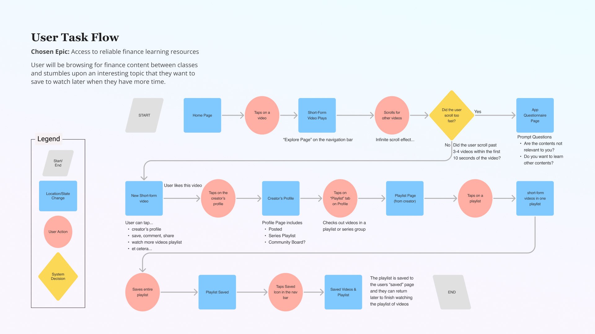
Task Flow
The task flow is help focus my main design goals for my app
Step 3: Develop
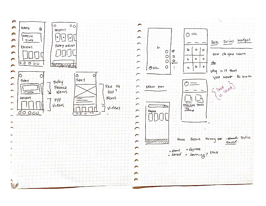
Exploratory Sketches
I started sketches designs for my proposed solution. I wanted it to be easy for my target audience to pick up the app and use right away. For this reason, I took many inspirations from TikTok, Instagram Reels and YouTube Shorts.

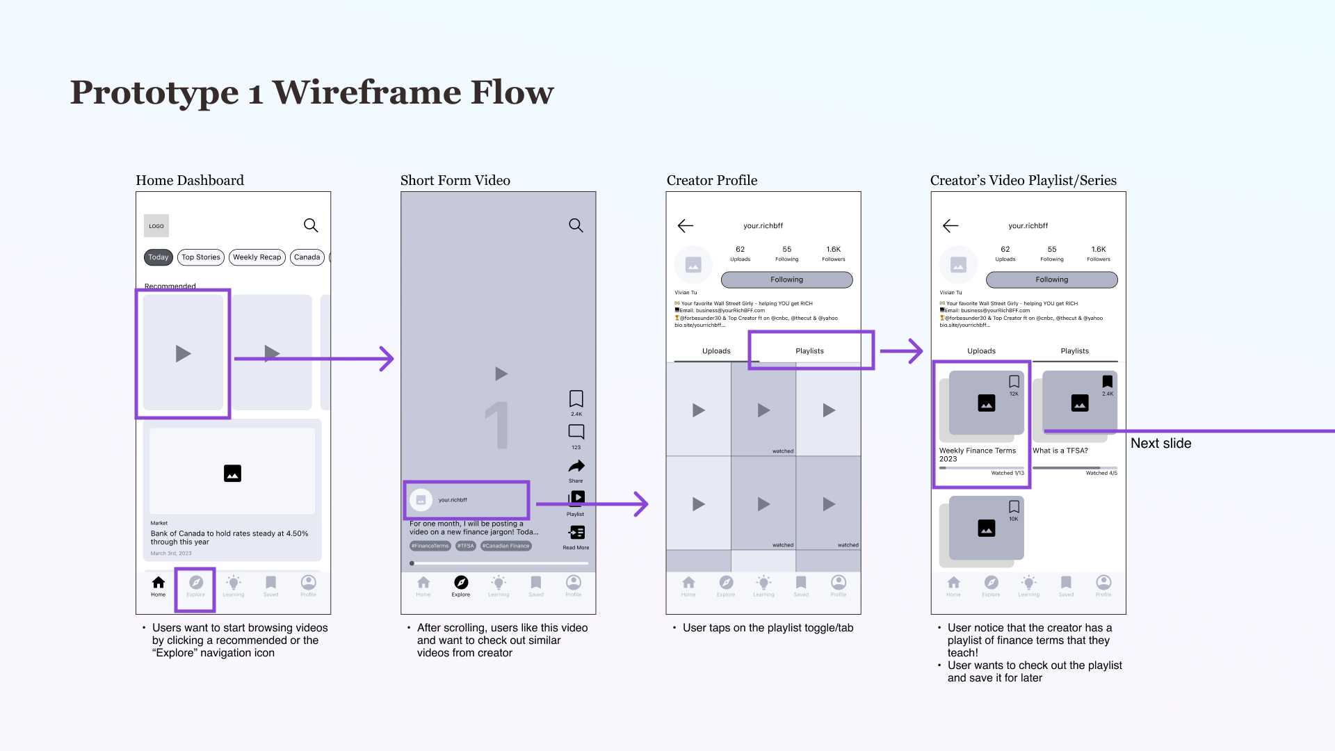
Mid-Fi Wireframes
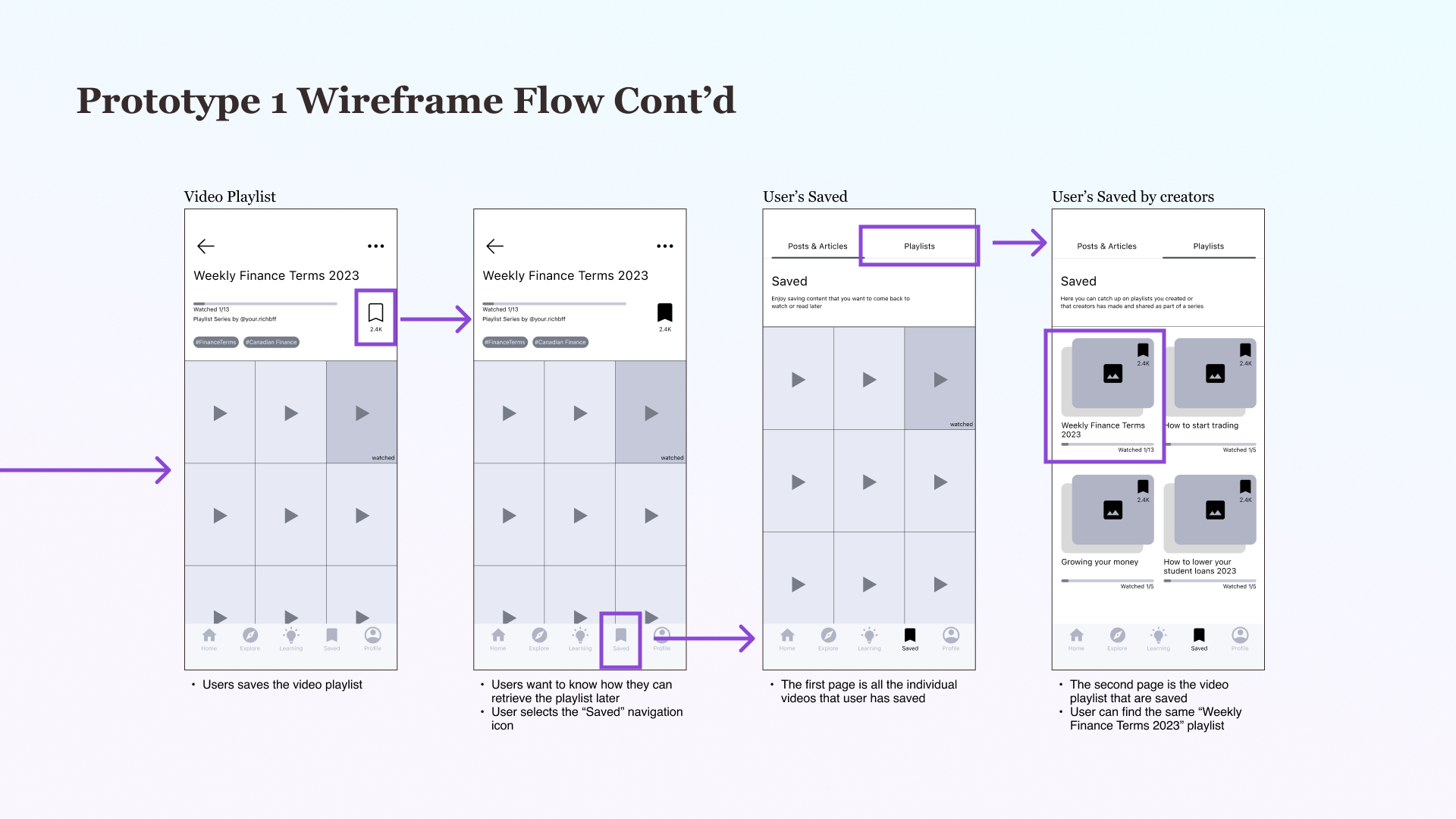
User Testing
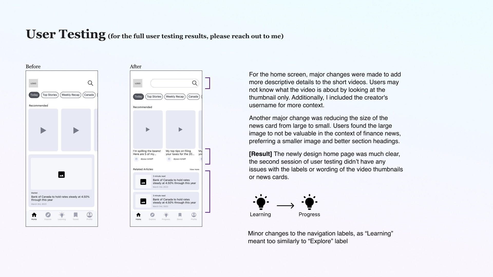
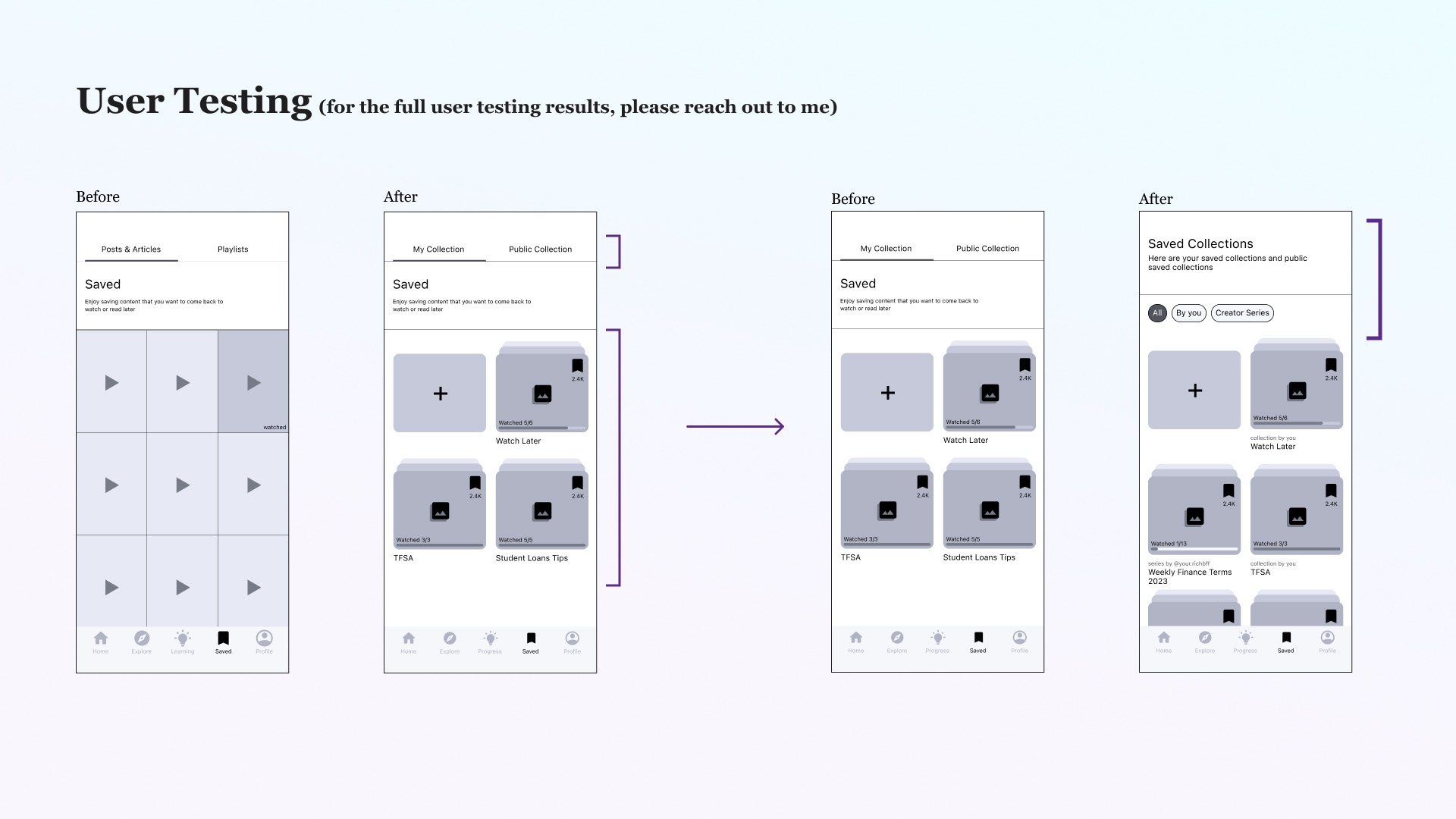
After creating the greyscale wireframes of my design, I conducted two rounds of user testing with 5 different users each time. Through the testings, I was able to observe users’ reactions and interaction with the design solutions. With the users’ input, I needed to adjust and refine my design for a more seamless user experience.
Step 4: UI & Branding
The Final portion of the project was to begin to transition to Hi-Fi design and building a brand.
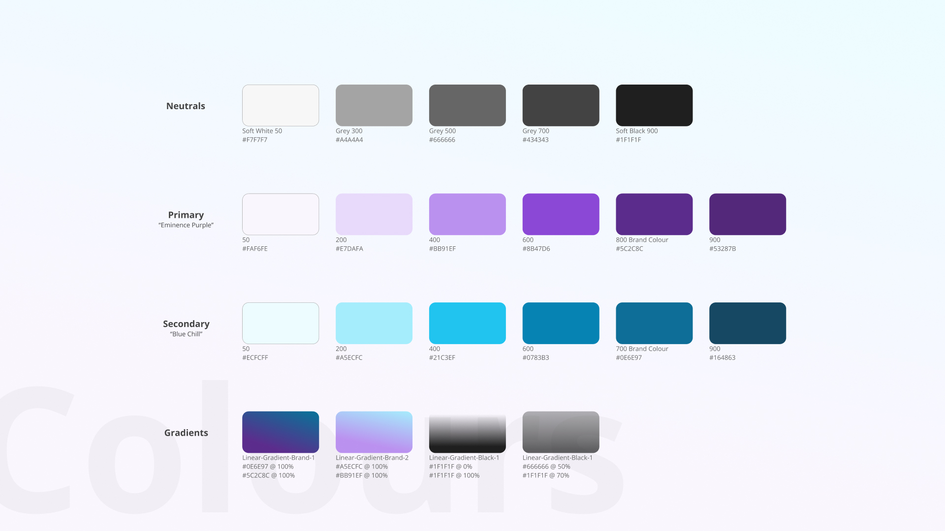
Colours
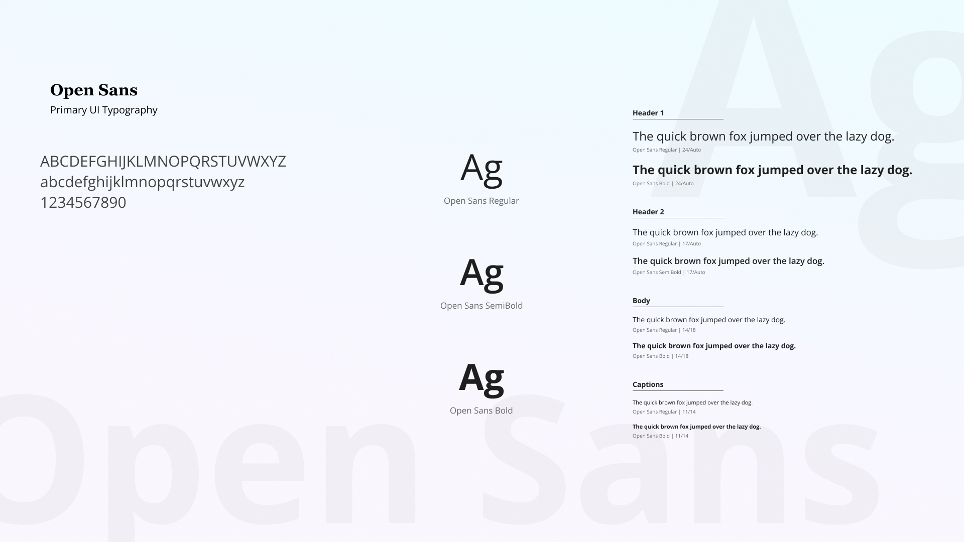
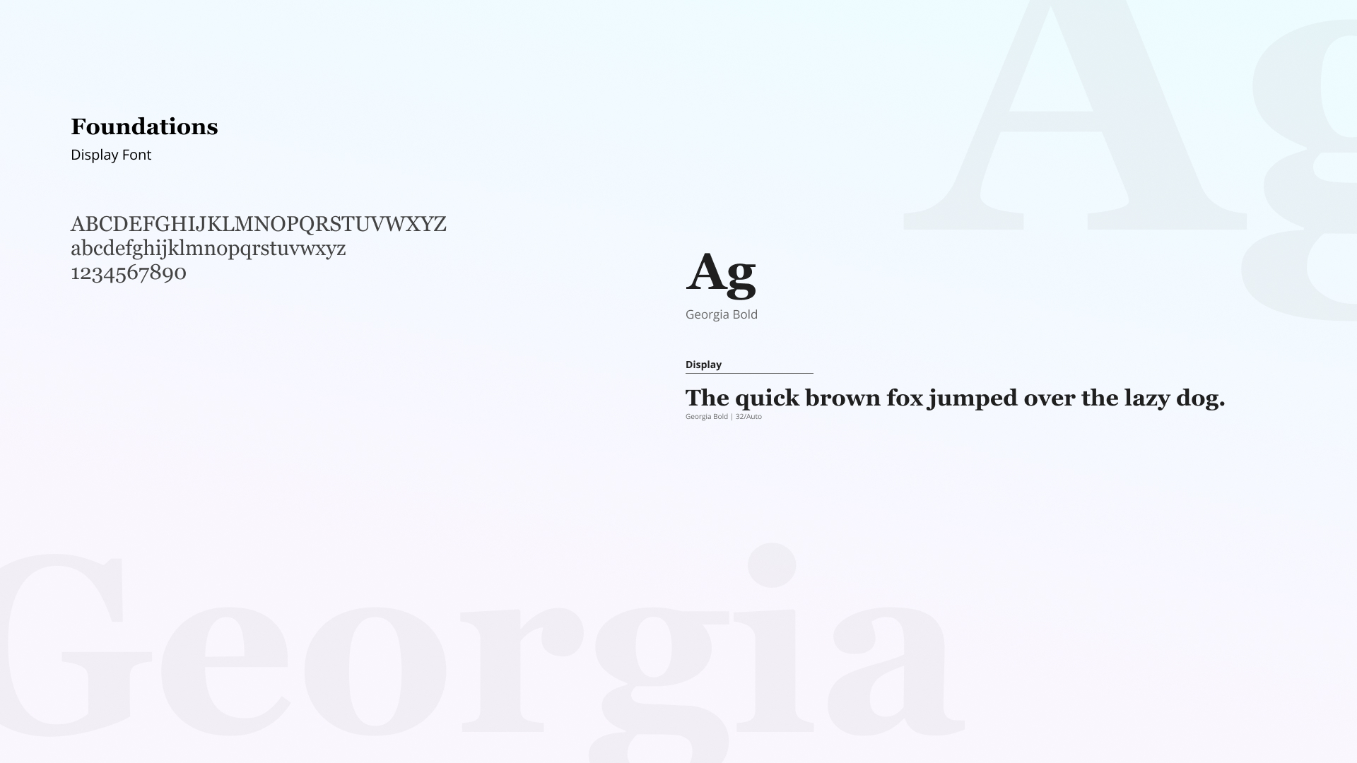
Typography
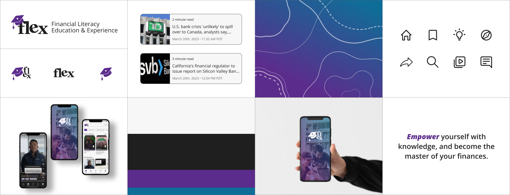
Brand
I wanted to create a strong branding for my app to help deliver the value proposition of the app
Hi-Fi Wireframes
With the UI Colours and Typograohy developed, I am able to add real content into my mid-fi wireframes. Having actual videos playing in the prototype really helped bring the overall app together.
Final Takeaway
How Effective is My Design?
With final user testing testimonials and my hypothesis, I constructed a list of the effectiveness of my design
- easily accessible for the younger generation and to eliminate the taboo of speaking about finances.
- Users instantly know how to use the app; low learning curve
- Compared to the social media platforms where the main purpose is engagement (like, comment, share), Flex’s main focus is to be able save lessons videos for later use, and track your learning plan
- Reducing the stress over learning complicated financial terms with no guidance
Key Learnings
- Trust the process and go with the flow: keeping in mind that UX is not linear and we will always have to go back and iterate
- Organization: having files, layers, components etc. named properly to avoid future frustrations
- Always give yourself time to breathe: Taking breaks when needed, a fresh mind will solve the problem better than a clutter mind
Future Changes
After given some time to rest, I would like to revisit my design solution and bring fresh ideas that I might not have thought of during the bootcamp time frame constraints. I would also like conduct further research with my target demographic to better understand their pain points.
- Adding a learning progress bar: Users can track the different finance topics they have watched
- Testing: If users want to test if they retained the information, they can easily test themselves if they would like
- Education Points: Like Duolingo, the more topics or educational video that the user watches, the more experience points they get and the build their financial literacy skills!!